As I’ve begun to get to know our new MSc GIS students, I was thinking of fun projects we might be able to do together in the labs. I thought it might be interesting for them to try receiving data directly from passing satellites. Today I captured an image from a passing Russian satellite using a very compromised station setup. This pass was centred on the Caspian Sea (the British Isles are on the left-hand side of the image). I think with a few improvements to the antennas our students can try building and operating their own ground stations this summer!
Uncategorized
Publication: Southern limit of the Patagonian ice sheet
I’m pleased to have made a contribution to the recently published paper with an international team led by collaborators at the British Antarctic Survey. For a limited period, the article can be accessed without a subscription here.
Moraine crest or slope: An analysis of the effects of boulder position on cosmogenic exposure age
A paper that I was involved with has just been published! My input was mostly around refining some of the statistical methods used. All credit to Matt Tomkins and colleagues who have been doing thorough work for years to push the limits of what Schmidt Hammer measurements of glacial deposits can tell us.
Extended Focus Photomicrographs
I’ve recently been asked about producing extended focus photomicrographs of pollen and other complex shaped objects, using bright field microscopy. I thought I’d write up a quick guide to doing this using the equipment we have in our laboratories. It is particularly useful when producing illustrations for publications, where a single plane of focus cannot capture all of the detail and texture of objects like pollen grains. Best results are achieved using a good quality lens on a microscope that is fully aligned using the Koehler Illumination method.
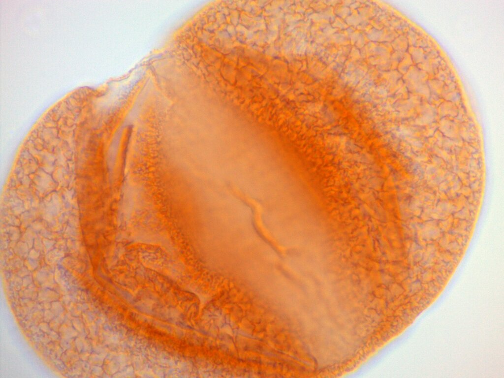
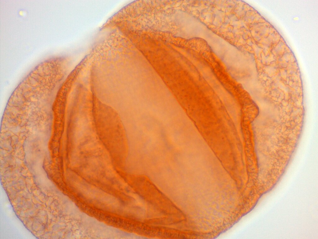
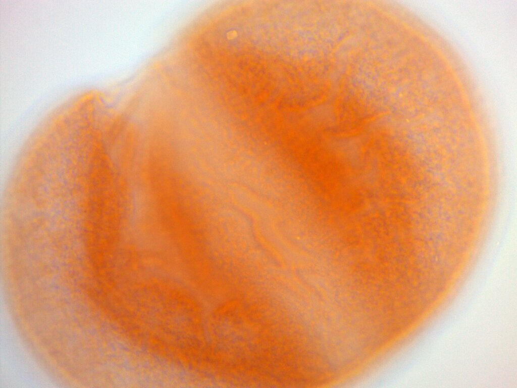
The images used here were captured using our Zeiss Ax10 Scope A.1, AxioCam Erc5s camera, Zeiss EC Plan-NEOFLUAR 100x oil-immersion objective lens, and Zeiss ZEN v3.3 software, by Tom Bishop in March 2021. The specimen is a grain of Cedrus atlantica pollen mounted in glycerol.
We’ll be using imageJ (here version 1.53e) and the Extended Depth of Field Plugin. imageJ only needs unzipping into an appropriate location, and the plugin file (*.jar) just needs to be saved to the folder ImageJ/plugins/
in order for it to be available in software. The examples images are available from the links below:
- https://thomasbishop.uk/wp-content/uploads/2021/03/scale_0.01mm_per_div.tif
- image 1
- image 2
- image 3
- image 4
- Open imageJ (
imageJ.exe
) and navigateFile > Import > Image Sequence... > Browse
and select the directory that contains the source images. They need to be in their own directory, as imageJ will load all images in the directory. - Check the images by pressing the play button in the bottom left hand corner of the image window. This will cycle through all of the images you have loaded. Try not to include images that do not contain any areas of good focus.
- Navigate to
Plugins > Extended Depth of Field > 3D EDF
and clickRun
. Depending on the speed of your computer, processing will take a few moments – no progress bar will appear. - A few different products will appear.
Close
the3-D Extended Depth of Field
window and close all of the open images apart from the one titledTexture
. - If you want to add a scale bar, navigate to
File > Open...
and select the image of the scale bar. - Select the straight line tool from the menu and draw a line between the ten divisions in the image.
- Navigate to
Analyze > Set scale...
and set theKnown distance
parameter to100
, and theUnit of length
tomicrons
. Each division is 0.01 mm, so the ten divisions are 0.1 mm, or 100 microns. - Tick the
Global option
and selectOK
. - Select the
Texture
image. NavigateAnalyze > Tools > Scale Bar...
and modify the parameters to your preference. The settings are previewed in the image. ClickOK
to continue. - Save the image using
File > Save As...
and choose a format of your preference.
itraxR Published on CRAN
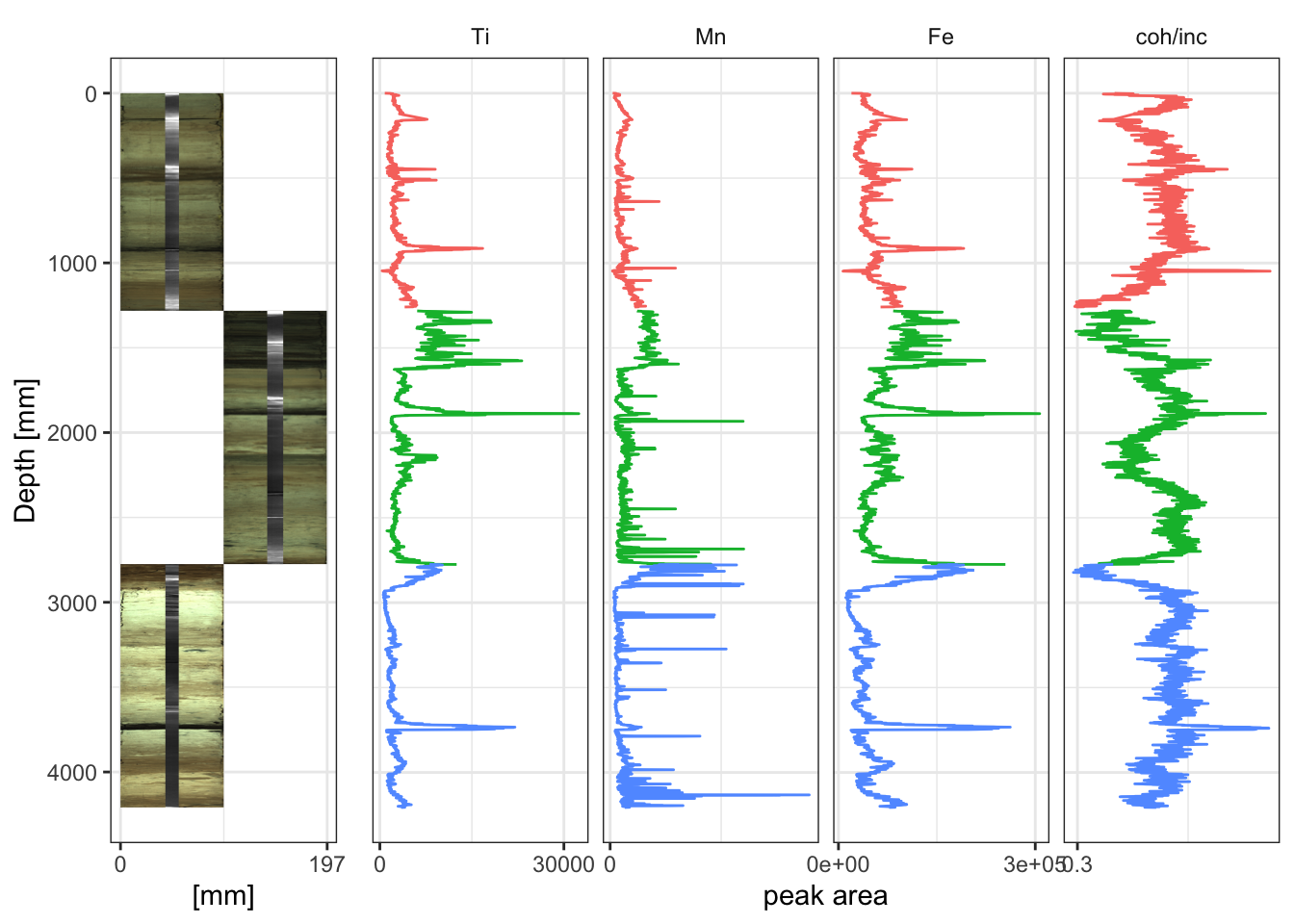
My itraxR package has been published on CRAN! This package can be used to ease the pain of working with large datasets from Itrax core scanners. It works with radiographs, colour images and the XRF element peak-area data, along with all the relevant metadata. It’s still a work in progress, with plenty of functionality to add, but it has enough finished functionality to make a first release.
The package is fully documented, but I am also writing a detailed guide for working with Itrax scanner data in R, available here. This includes recipes for creating complex, publication-quality plots.
Please get in touch if you have bug reports, feature requests or other comments. You can use the issues feature on Github, or just email.
Common UK Lat/Long Errors and How to Spot Them
It is not uncommon for spatial data to have formatting or parsing problems, and new users can spend an awful lot of time troubleshooting what is usually a simple problem, whereas experienced users can often spot these errors just by the nature of the faulty output. For example, those working in with geographic data for the United Kingdom know that when their data points are turning up near the Seychelles, they have transposed (swapped) the latitude and the longitude! Below is a quick map (with accompanying code) that demonstrates this.
library(tidyverse)
library(ggrepel)
points <- tibble(long = c(-2.2426, 2.2426, -2.2426, 53.4808),
lat = c(53.4808, 53.4808, -53.4808, -2.2426),
label = c("correct", "inverted long.", "inverted lat.", "transposed lat./long."),
colour = c("good", "bad", "bad", "bad"))
ggplot(mapping = aes(x = long, y = lat)) +
geom_polygon(data = map_data("world") ,
aes(group = group),
fill = "grey",
colour = "grey50") +
geom_point(data = points, aes(colour = colour)) +
geom_label_repel(data = points,
aes(label = label, colour = colour)
) +
theme(legend.position = "none")
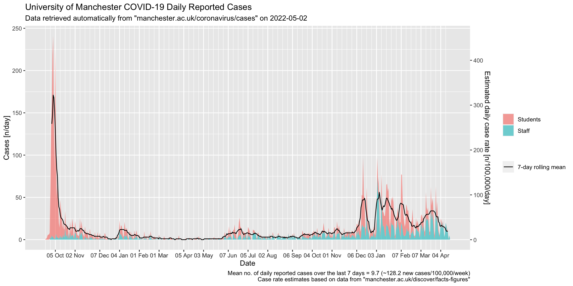
UoM Reported Covid Cases
I like working on my data presentation, and I thought I could probably improve the current offering on this page. I made a graph that I preferred, then set it up on a simple Github Pages that re-generates each weekday using Github Actions.
Low Cost CO2 Display
The lab is cold and half-empty because of the current COVID-19 social distancing measures in place. These are aimed at reducing the risk associated with viral transmission by aerosols. This means reducing the number of people breathing into a given volume, and increasing the turnover of fresh air in the same volume. There are many calculations and computer simulations that have gone into developing these rules, but the basics are pretty simple – more ventilation, fewer people. In practice this is quite easy to achieve in a laboratory like ours – the three fume cabinets along one wall mean there is a high turnover, and we’ve got lots of smaller side labs.
A number of researchers have proposed that the CO2 concentration of a volume provides a good proxy for the overall potential risk in every-day settings, and that this presents a low-cost empirical way of managing this risk. This is because CO2 is a by-product of people breathing (breath has a CO2 concentration of around 38,000 ppm), and if a room has poor ventilation the CO2 will gradually increase. If a room is well-ventilated it will equilibrate with the outside air, usually around 400 ppm. Some have proposed that a CO2 concentration of 600–1000 ppm should be aimed for, others have complex models for setting the risk level (see Peng & Jimenez, 2020).
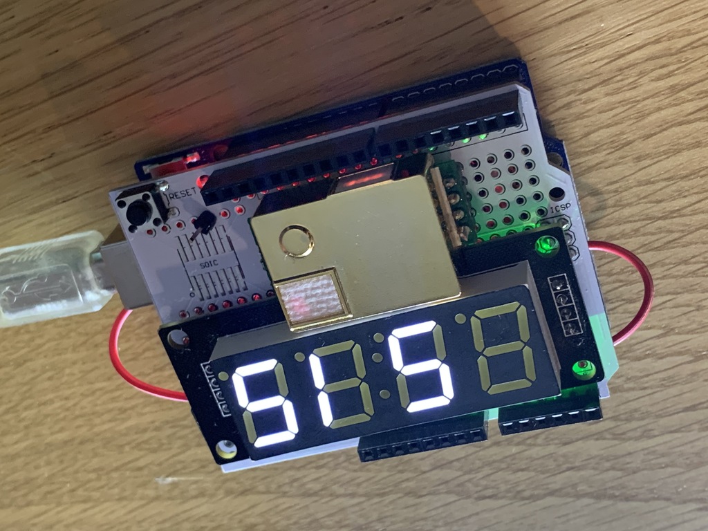
We have many way of measuring CO2, including the Los Gatos gas analyser, The ADC IRGA, and Sarah Brown’s low-cost sensors, but I was curious to see just how cheaply it could be done. The system I have built uses a generic Arduino UNO-type board (~$2), a breadboard (<$1), a 4-segment display (<$1) and at its heart, a Winsen MH-Z19B NDIR CO2 sensor (~$12). The entire package can be made for around $15. My implementation uses the code implemented by Github user Erriez, available at Github (Erriex/ErriexMHZ19B). Before I discovered Erriez’s implementation I spend an evening learning to use Realterm to send and receive hex strings for the first time. I also added a quick way to enable the calibration mode by wiring in the pin (shown near the reset button) and adding a spare wire (in red) to short this to pin to ground. When I get a moment in the lab I’ll check it against our reference units and see how it performs.
Rhynian Chert Images
I’ve recently made my first submissions to Wiki Commons – a set of images of the very famous Rhynian Chert, which contains some of the earliest fossils. The images are available at Wiki Commons here. The slides come from the Manchester Museum and were imaged for educational purposes, including some mosaics.
Bicycle Running Costs
I’ve been cycling to work for three years now, and I have been asked what the benefit is. There are three:
- It’s cheaper; I will save £5,875 over a 5 year period compared to if I were to travel by rail.
- It’s quicker. I will save 125 hours (over 5 entire days) per year compared to travel by rail.
- It’s good for my health. It improves my core strength, muscle tone, and at 280 calories per day (≈ 1.5 pints of beer), makes it easier to balance my diet.
I have based my calculations on my records from the last three years. The bicycle cost £510 (including a cycle scheme reduction). I have spent only £75 on servicing, but have invested in my own tools to do my own where possible. Spare parts, accessories, clothing and tools have combined to cost £810 over the three years I’ve owned the bike.
Having covered 10,470 km in commuting (and another 1,360 km of riding for fun), the bike costs me less than 8 pence per km, which compares favourably to the HMRC rate for business travel by bike, which is 12 pence per km.
I should add that these costs can be reduced considerably – my bike was expensive (£680 list price), and is over-specified for commuting (because I use it for fun sometimes!). In addition, my calculations include the cost of my tools, which will last much longer than the 5 years. Also, I choose to wear sports clothing to ride (mostly because I have changing and shower facilities at work), but many would choose not to. A wiser choice of cycle for commuting would also mean lower running costs, for example by using a cycle with an enclosed drive chain; perhaps treat my costs as a higher estimate.
As for the often asked questions regarding safety, I’ll say this: my ride along a busy commuter stretch of the A6 at rush-hour every day never fails to show me examples of poor driving, with the most common offenses being drivers not paying attention (turning without signalling, creeping over ASL’s and using mobile phones), and drivers “rushing to go nowhere” (that is, speeding, performing close-passes, or undercutting only to end up in the same queue of traffic a few yards on). However, in the last three years I have never collided with a motor vehicle – I have collided at low speed with a pedestrian who ran in-front of me at a pelican crossing while I turned on a green signal (we were both absolutely fine). My good fortune so far is probably a consequence of defensive cycling and dumb luck, and I long for good quality, segregated infrastructure, but I won’t let the under-investment in road infrastructure and the poor standard of UK motorists cost me the already very real benefits of riding my bike to work every day.